Create histograms and hollow histograms. This function permits easy color and appearance customization.
Usage
histPlot(
  x,
  col = fadeColor("black", "22"),
  border = "black",
  breaks = "default",
  probability = FALSE,
  hollow = FALSE,
  add = FALSE,
  lty = 2,
  lwd = 1,
  freqTable = FALSE,
  right = TRUE,
  axes = TRUE,
  xlab = NULL,
  ylab = NULL,
  xlim = NULL,
  ylim = NULL,
  ...
)
Arguments
- x
Numerical vector or a frequency table (matrix) where the first column represents the observed values and the second column the frequencies. See also
freqTableargument.- col
Shading of the histogram bins.
- border
Color of histogram bin borders.
- breaks
A vector for the bin boundaries or an approximate number of bins.
- probability
If
FALSE, the frequency is plotted. IfTRUE, then a probability density.- hollow
If
TRUE, a hollow histogram will be created.- add
If
TRUE, the histogram is added to the plot.- lty
Line type. Applies only if
hollow=TRUE.- lwd
Line width. Applies only if
hollow=TRUE.- freqTable
Set to
TRUEifxis a frequency table.- right
Set to
FALSEto assign values ofxthat fall on a bin margin to the left bin. Otherwise the ties default to the right bin.- axes
If
FALSE, the axes are not plotted.- xlab
Label for the x axis.
- ylab
Label for the y axis.
- xlim
Limits for the x axis.
- ylim
Limits for the y axis.
- ...
Additional arguments to
plot. IfaddisTRUE, these arguments are ignored.
Examples
histPlot(tips$tip, main = "Tips")


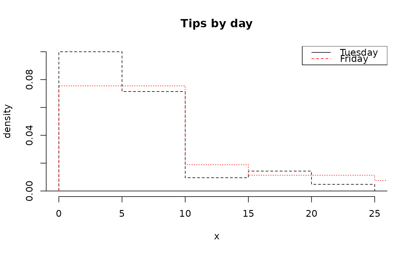
# overlaid hollow histograms
histPlot(tips$tip[tips$day == "Tuesday"],
  probability = TRUE,
  hollow = TRUE,
  main = "Tips by day"
)
histPlot(tips$tip[tips$day == "Friday"],
  probability = TRUE,
  hollow = TRUE,
  add = TRUE,
  lty = 3,
  border = "red"
)
legend("topright",
  col = c("black", "red"),
  lty = 1:2,
  legend = c("Tuesday", "Friday")
)


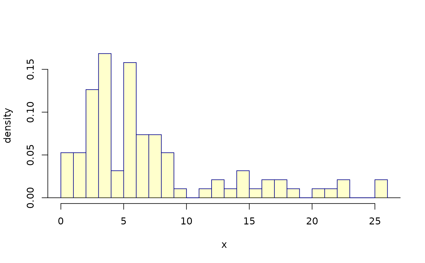
# breaks and colors
histPlot(tips$tip,
  col = fadeColor("yellow", "33"),
  border = "darkblue",
  probability = TRUE,
  breaks = 30,
  lwd = 3
)


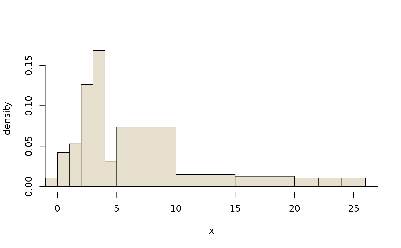
# custom breaks
brks <- c(-1, 0, 1, 2, 3, 4, seq(5, 20, 5), 22, 24, 26)
histPlot(tips$tip,
  probability = TRUE,
  breaks = brks,
  col = fadeColor("darkgoldenrod4", "33"),
  xlim = c(0, 26)
)

