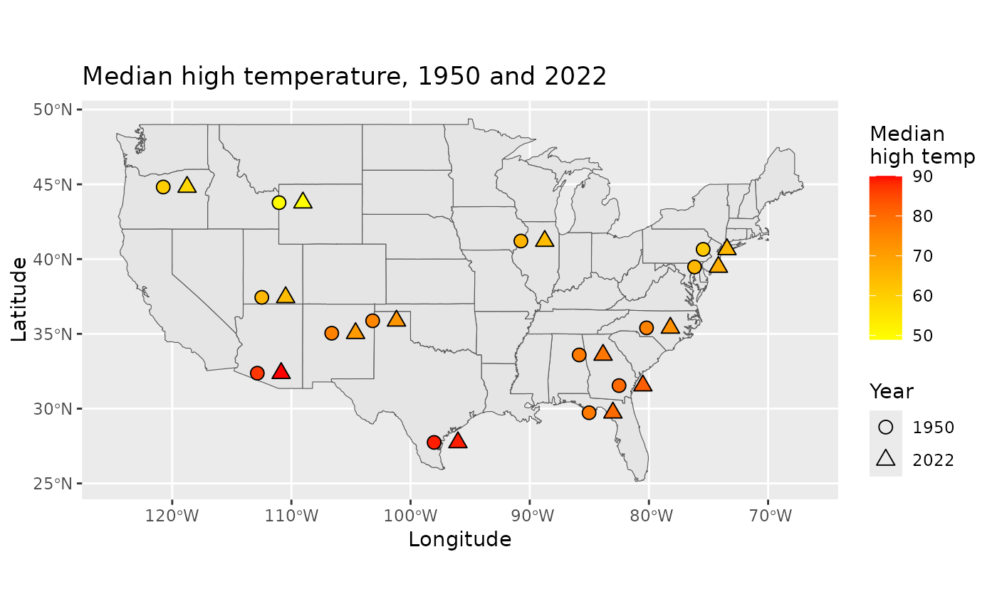
A representative set of monitoring locations were taken from NOAA data that had both years of interest (1950 and 2022). The information was collected so as to spread the measurements across the continental United States. Daily high and low temperatures are given for each of 24 weather stations.
Format
A data frame with 17250 observations on the following 9 variables.
- station
Station ID, measurements from 24 stations.
- name
Name of the station.
- latitude
Latitude of the station.
- longitude
Longitude of the station.
- elevation
Elevation of the station.
- date
Date of observed temperature.
- tmax
High temp for the observed day.
- tmin
Low temp for the observed day.
- year
Factor variable for year, levels:
1950and2022.
Source
https://www.ncei.noaa.gov/cdo-web/, retrieved 2023-09-23.
Details
Please keep in mind that these are two annual snapshots from a few dozen arbitrarily selected weather stations. A complete analysis would consider more than two years of data and a more precise random sample uniformly distributed across the United States.
Examples
library(ggplot2)
library(maps)
library(sf)
#> Linking to GEOS 3.10.2, GDAL 3.4.1, PROJ 8.2.1; sf_use_s2() is TRUE
library(dplyr)

# Summarize temperature by station and year for plotting
summarized_temp <- us_temp |>
  group_by(station, year, latitude, longitude) |>
  summarize(tmax_med = median(tmax, na.rm = TRUE), .groups = "drop") |>
  mutate(plot_shift = ifelse(year == "1950", 0, 2))

# Make a map of the US as a baseline
usa <- st_as_sf(maps::map("state", fill = TRUE, plot = FALSE))

# Layer the US map with summarized temperatures
ggplot(data = usa) +
  geom_sf() +
  geom_point(
    data = summarized_temp,
    aes(x = longitude + plot_shift, y = latitude, fill = tmax_med, shape = year),
    color = "black", size = 3
  ) +
  scale_fill_gradient(high = "red", low = "yellow") +
  scale_shape_manual(values = c(21, 24)) +
  labs(
    title = "Median high temperature, 1950 and 2022",
    x = "Longitude",
    y = "Latitude",
    fill = "Median\nhigh temp",
    shape = "Year"
  )

