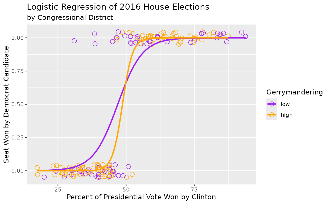
A dataset on gerrymandering and its influence on House elections. The data set was originally built by Jeff Whitmer.
Format
A data frame with 435 rows and 12 variables:
- district
Congressional district.
- last_name
Last name of 2016 election winner.
- first_name
First name of 2016 election winnner.
- party16
Political party of 2016 election winner.
- clinton16
Percent of vote received by Clinton in 2016 Presidential Election.
- trump16
Percent of vote received by Trump in 2016 Presidential Election.
- dem16
Did a Democrat win the 2016 House election. Levels of 1 (yes) and 0 (no).
- state
State the Representative is from.
- party18
Political Party of the 2018 election winner.
- dem18
Did a Democrat win the 2018 House election. Levels of 1 (yes) and 0 (no).
- flip18
Did a Democrat flip the seat in the 2018 election? Levels of 1 (yes) and 0 (no).
- gerry
Categorical variable for prevalence of gerrymandering with levels of low, mid and high.
Examples
library(ggplot2)
library(dplyr)
ggplot(gerrymander |> filter(gerry != "mid"), aes(clinton16, dem16, color = gerry)) +
  geom_jitter(height = 0.05, size = 3, shape = 1) +
  geom_smooth(method = "glm", method.args = list(family = "binomial"), se = FALSE) +
  scale_color_manual(values = c("purple", "orange")) +
  labs(
    title = "Logistic Regression of 2016 House Elections",
    subtitle = "by Congressional District",
    x = "Percent of Presidential Vote Won by Clinton",
    y = "Seat Won by Democrat Candidate",
    color = "Gerrymandering"
  )
#> `geom_smooth()` using formula = 'y ~ x'

